Thursday, November 8, 2012

It's World Usability Day

November 8, 2012 is World Usability Day. 
 
World Usability Day was begun in 2005 by what is now known as the UXPA (User Experience Professional Association).
 
"Held annually on the second Thursday in November, World Usability Day promotes the values of usability, usability engineering, user-centered design, universal usability, and every user's responsibility to ask for things that work better. The day adopts a different theme each year. Organisations, groups or individuals are encouraged to hold events to mark the day, optionally according to that year's theme." (Wikipedia)
 
As stated on WorldUsabilityDay.org, usability is "about "Making Life Easy" and user friendly. Technology today is too hard to use. A cell phone should be as easy to access as a doorknob. In order to humanize a world that uses technology as an infrastructure for education, healthcare, transportation, government, communication, entertainment, work and other areas, we must develop these technologies in a way that serves people first."
 
As an organization committed to its' customers and to making their life easier, its imperative that we pay attention to this aspect of usability and make room for it to be an intrinsic aspect of our products. By utilizing usability in our approach to product development and design, we are ensuring that these products-no matter the medium of delivery- are developed and designed in a way that keeps our customers at the center of the process.
 
This video from WorldUsabilityDay.org offers a great explanation and background on the importance of usability.  


from WorldUsabilityDay.org


To learn more about what's happening around the world for World Usability Day, please check out the World Usability Day Homepage

Thursday, October 25, 2012

Is UX work really saving us time?

Every product has a starting point. When we develop a product disconnected from a clear understanding of it's ultimate user, the product success will either be compromised or worse, end in frustration for the user. 

When a product fails to meet our customers' needs and we have to redo the product (for one reason or another) the cost of our time and resources is very clear. In fact, at that point, the costs are quantifiable. We can look at the product and say, "We had to spend this much time and money rewriting, redesigning, recopyediting, reprinting etc....."

However, when we develop a product utilizing user-centered design principles,we are often not as aware of how the time taken on the front end of development results with time savings for our customers as well as ourselves once the product is on the shelf. 

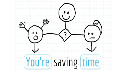
I recently came across a unique exploration into the connection between UX work and time. Andrew Mayfield, CEO of Optimal Workshop, digs deeper into this topic of how UX (user-experience) work and time-saving are connected in his interactive infographic called "You're saving time". 

Click the image below to open up Andrew's infographic:

 
Image by Andrew Mayfield, CEO, Optimal Workshop
Used with Permission

Thursday, October 11, 2012

More Does Not Necessarily Mean Better

I was thinking recently about the poem by Robert Frost, The Road Less Taken. For those unfamiliar with the poem, it begins with

“Two roads diverged in a yellow wood”……

It makes me wonder if a poet today had written such a piece  would they have begun with the following: 

“Forty-Two roads diverged in a wood...
-and then I just couldn’t make a choice”.
 
Today, no matter where we go and what we do, we are presented with choices, options and extras.
Sometimes it’s comforting to know we have options. Other times, the simplicity of a single path is a welcome relief from the overabundance of options available in so many aspects of our life.

One project of the past year illustrates this point particularly well.  

CASE STUDY:  Catholic Faith Handbook for Youth Catechist Guide

The project team for the Catholic Faith Handbook for Youth Catechist Guide wanted to ask our customers to evaluate the ease of use of a lesson plan format. The team sent two different lesson samples to five different customers and asked the customers to carry out specific tasks with each version.  (The tasks came from the teams understanding of the customer’s weekly lesson ritual which had emerged during their site observations.)
Then the team waited to receive the customer’s feedback. The team was seeking feedback not aimed at a customer’s impression of a product or whether they would prefer to use this product over another.  Rather, the team wanted to get to the root of the product and understand the customer’s experience of carrying out the specific lesson related tasks by using –and forging a path through-each of the two sample lesson plans.

How easy would it be for the customer to use the lesson plan to carry out the work they needed to complete?
What happened was something I don’t think the team anticipated. I know I didn’t.

This is a summary of what happened.

Brian S-T stopped by my (Heather’s) office and said, “We got our first reviewer back, do you want to see the feedback?”

We looked at the feedback and said to each other, “Well let's see, maybe it won't all be this clear.”

By the end, we were surprised, because this is what we saw.


With regards to using Lesson Plan “B”, customers said:  

  •  “Early on I realized that these lessons were a little too complicated for some of my teachers, so I streamline the lesson plans by writing the specific areas and activities they should cover in each lesson. Basically, I rewrite the lesson plans.”
  • “I feel this Lesson Plan was too cumbersome for a greenhorn volunteer teacher."
  • “This lesson would be difficult for those not used to looking through curriculums, and they might need to do a lot of preparation”.
  • “This plan is not very easy to use, especially if you have limited teaching experience.”
  • “It is way too much for what we need to teach our classes.  Our catechists get overwhelmed with all this information.”

With regards to using Lesson Plan “A”, customers said:  

  •  “Lesson Plan A is so much better for volunteer teachers who do not have formal teaching experience.”
  • “Lesson Plan A gave me much better direction.”
  • “These would be much easier for my catechists to use.”
  • “I like the simplicity of it.”
  • “I thought this was MUCH better than the other catechist handbooks that are out there as far as ease of use.”
  • “For us small parish volunteer teachers who are not theologians nor college educated teachers, and most of us have never attended a Catholic school, I found this format non-intimidating yet informative and chronologically arranged.  Easy to follow and good guidance.”
  • “I think this would be great for a volunteer catechist, it tells what the important things they need to learn are, gives activity ideas, and helps guide them into scripture and discussion.”
  • “It is very well laid out – not too much, just the right amount of information.”
  • “Thank you for creating lessons that volunteers can use!”

For the record, Lesson Plan “B” was the product in its current state of content and design, available for purchase on our website.  
 
Lesson Plan “A” was a version containing a variation of content quantity, activity ideas, design, layout and organization based on what we understood our customer may be needing.

After received the feedback, the project team reconvened and came to the conclusion that in terms of usability for our customers, it was pretty black and white.

In Lesson Plan “B” (the product in it’s current state of content and design) we had covered all the bases covered for the customer. This version assumed that the user would prefer the highly designed lesson plan and that the customer would need and want every option and every aspect of direction.

In Lesson Plan “B”, we wanted to provide the user with every possibility and in doing so, we gave them more than they could carry.

As a publisher, we want to help lighten the load of those we serve.

In Lesson Plan “A”, the project team came up with and then tested an innovative solution that involved--not adding to the lesson plan-- but rather scaling it back and highlighting a more clear-cut and direct path through the material.

As our customers persevere in their work of spreading the gospel, let’s assist them (as this project team did),  by continuing to clear the path of infinite options and light the way to a single path so that their experience is one of clarity and one which saves them time.  

As we do, we will continue to affirm for them that what they can expect from their partnership with us and their use of our products is an experience of –signature simplicity.


Thursday, September 27, 2012

Observation, Failure and the Road the Success

Last week, the newly formed product development and innovation team met for our first working session.We had a number of tasks to tackle on our agenda including brainstorming, data mining, ideation and product prototype creation.
One small part of our time together on the first day was spent talking about an article on the Culture of Innovation at 3M. We discussed some of the aspects that seem to contribute to the culture of innovation at this Minnesota-based company known the world over for its inventiveness and innovation.
  • We noted that 3M employees are given a percentage of time to work on any project they deem time-worthy and that often, new successful products for the company flow from this "percentage of time” people dedicate to working on their own ideas.
  • We recognized the role customer observation plays in understanding the habits as well as the articulated and unarticulated needs of their customers.
  • We also talked about the role failure plays on the road to success, the necessity of “being okay” with failure and of knowing that failure is a part of moving forward. Failure is part of the trial and error that is often the mark of innovation and re-invention.
At one point, we slowed the conversation and asked ourselves, “What does it mean to fail”.
Reflecting on this conversation after our meeting, and thinking about the many times I’ve heard people talk about the“importance of failure”, it still sometimes seems like the word itself –failure- is even an obstacle. There can be a palpable difference in the air, an almost hushed silence that comes over people when the word “failure” is spoken, as if the mere speaking of the word has the power make it a reality.
But what does the word “failure”mean? What does it mean “to fail”?
Being someone who likes to go back to the beginning and understand words at their origins, I looked up the word“failure” and “fail” in an online etymology dictionary: http://www.etymonline.com/.
fail
early 13c., from O.Fr. falir (11c., Mod.Fr. faillir) “be lacking, miss, not succeed,”
 
While the opposites “success and fail” are often looked at together, the words that jumped out at me were the first two: to be lacking, to miss.
As we continued our conversation as a product development and innovation team, this is exactly where we ended up going. We uncovered this reality: Just because a product doesn’t hit a home run with our customers right out of the gate, it doesn’t mean that it is over or at its end.
Rather, if something fails, it’s because somewhere in the product, something was lacking or missed the mark with our customers.
So, we figure out what missed the mark and try it again.
THAT is the beginning to reinvention and innovation.
 ______________________________________________________
To read the article on the 3M’s Culture of Innovation:  3M: The Culture of Innovation

Thursday, August 9, 2012

Innovation: There is more than one way to...

Our user experience (UX) work to date has given us opportunities to consider new products, new formats for existing products, new processes and new ways of thinking. It has given us and will continue to give us opportunities to innovate.


INNOVATION


1
: the introduction of something new
2
: a new idea, method, or device

The concept embedded within the work of innovation is the belief that many things in life-whether they be methods, processes, products,  approaches, or thinking -can be done in new ways, or ways different than they've been done before. 

Never is that reality more clear than when you watch a young child. Rarely do they approach things with the assumptions or certainty that our age and wisdom allow us to bring forward. Rather, children, by their very state in life, have this "beginner's mind", this idea of approaching everything as new, of not leaving possibilities unturned.

In some cases, it's because everything IS new for them and they are experiencing things for the first time. Sometimes, they have a beginners mind because they have not yet decided that one way is the only way or a better way. Other times, they have a beginners mind because their curiosity leads them to wonder if there is more to discover.

I was surprised the last time I visited my sister when I happened to catch my nephew discovering there was more than one way to use a piano bench. As he was playing, he leaned back on the piano bench, flipped it over, knelt down on top of it and kept playing. Hmmmm. Innovation and a beginner's mind at work.

Sometimes, it's when things are turned upside down (or feel like they are turned upside down), that we see things not just for what they are, but for what they can be, not just as something turned upside down, but as something wholly new-- a new way to use or engage with the product or process in front of us.

During one of the next company meetings, I've asked Sara, Jim and Brian to lead us in an activity that was first done on the innovation retreat in May. It is an activity about looking at a simple everyday object in new ways.


To view the "innovation of the piano bench" on YouTube, click below:


Thursday, July 26, 2012

Where Does Innovation Come From?

During my walk yesterday afternoon, I stopped by the Toner Center (on the campus of SMUMN) and was surprised to discover in the SMU gallery (right outside of Toner Lounge where we gathered for the summits), an exhibit about the Innovations of Brother Finbar.

Not only are some of the actual innovations on display, but there are descriptions of how each innovation began. Seeing this exhibit reminded me once again that innovation often stems from or out of a particular experience of life.

In the case of some of the innovations on display, the innovation began from a pain point or something someone was trying to do in a certain way but was not able to.  Other times, the starting point was an instinct or an idea. Sometimes the innovation was something wholly new; other times, it was a change made to something already in existence.

What surprised me, though, as I went through the exhibit was the connection I noticed between innovation and daily life. The innovations were practical.  Rather than creations that sit on a shelf for people to admire (which also have their place), these were innovations that allowed people to interact with the world around them in new ways.

What a wonderful thing: to influence & impact how people interact with the world around them.

When you see some of the things that Brother Finbar created you will see that in what he created, he has influenced how people interact with the world.  

By influencing their interaction, he has influenced their experience.  

I would encourage you take the time before August 19 to explore the gallery of innovations at SMUMN.  Go by yourself, go with your team, go with your department, but go...and, as the poster in the gallery says, “Discover the Innovations Around You".

Click here to see some of Bro. Finbar's work

Thursday, July 12, 2012

Why We Need to Challenge Our Assumptions

One afternoon,  Megan, Jason and I  were sitting around the table in the Steger Conference Room as Christy tested a paper (prototype) version of an iPad app for us. 

Jason, as facilitator, gave Christy the first task and asked her to complete it with the prototype (or sample) in front of her and asked her to talk about what she was thinking, doing and seeing as she carried out the task. 

Then he gave her the same task and asked her to complete it with a different variation of one of the functions in the prototype.  All in all, we gave her four variations to test the task on.

On the second or third variation, I remember observing her relationship with the prototype change.  She started progressing differently in the completion of the task and her comments seemed to suggest a particular favor for the variation.   She made the comment, “ I really like this one because it’s more linear; it makes sense to me.”

I assumed I knew what she meant. I assumed she meant she liked the shape of it, the way it used lines.

But I decided to ask a question just to check and to challenge my assumption.


It turns out that’s not what she meant at all.


When I asked Christy, “When you were carrying out the task, you said it was linear and that you liked that. Can you say more about that?”

Christy obliged us and explained that the way the functionality unfolded was very logical to her and felt like it was following along in a line; it made logical sense the way one part was flowing from the one before it.”

In the end, the variation that Christy found most logical and easiest to use was the same one that the other users seemed to gravitate toward in their test of the prototype. 

Asking Christy to “say more” about what she meant by the term “linear”, shattered the assumption I had built in my own mind and replaced it instead with the reality of what she as a user was expecting in terms of the flow of the functionality.  

She found favor with a particular variation of the prototype because the way she could interact with the product (or the user interface) in that variation matched the model she had in her mind of how the functionality would/needed to work. In user experience work, this means the product matched the "mental model" (or the model in the mind) of the user.

Because of the match, the same task felt easier with a particular type of interface or interaction. 

This, to me, is the great value of UX work and the unique benefit of the UX friendly questions and statements (that help to dig digger into the user’s experience).  No matter what assumptions we have, bring or begin with, when we go beyond what we ourselves bring to the table, we are opened up again and again to the mind of our customer, the mind of those who use our products. 

The more we understand the models in the minds of our customers, the more likely we are to create products that match those models and the more likely customers are to look at our product and recognize something that really fits!

_________________________________________________________

 To go deeper into this idea, read Susan Weinschenk's article in UXmag, the-secret-to-designing-an-intuitive-user-experience

Thursday, June 28, 2012

UPA Becomes UXPA: Why It Is Important

This year, at its 2012 conference in Las Vegas, the Usability Professional Association announced that it was changing its name from UPA (Usability Professional Association) to UXPA (User Experience Professional Association).

There was much response to the name change at the conference.  There was even more conversation after the conference.
Personally, I had a number of reactions to this change-all of them positive.  

For me:
  • the name change was surprising to hear because, prior to the conference, I didn’t realize that there was a larger conversation happening within the association itself.  The fact that this conversation is going on is important for us to be aware of and to pay attention to because it points to the overarching work that we do.
  • the name change was affirming because it mirrored the journey we have taken as an organization as we’ve waded through user-centered design principles and usability practices, user experience courses and white papers and reports, each of which called out different aspects of what we came to see as a concern for and a commitment to the overall user experience.
  • the name change was compelling in that it identified the unique and inexplicably important role user experience professionals play in the workplace.  Ronnie Battista, Director of Certification & Treasurer for the new UXPA shared that “businesses finally get the fact that no matter how much of the        market they’ve cornered, or what flashy new technology, product or service comes, they have come to a conclusion that’s innate to us. That people matter. Customers matter. Employees matter…UX professionals have been and remain the voice for the human side of business and technology.” 
  • Finally, I see the name change as a great act of leadership. Merriam-Webster.com  defines leadership as “the act or an instance of leading”.  There was also conversation at the conference about leadership being visionary.

In taking this step, I believe UXPA modeled for the field what leadership is. UXPA can see the vision that is forming, a vision of a reality that not quite everyone connected to this world can see or grasp just yet. But it’s there. And now, its name as an association encompasses that which every discipline and every person in a related field is aimed at ultimately affecting, this is, the overall user experience.

Thank you and congratulations to the new UXPA!


Thursday, June 14, 2012

What the New Class Learned-Part 2

Last week we heard from four of the folks that took part in the Certified User Experience Professional Class. 

This week, we hear from the second group of folks on what they learned and what they took away from the experience.  


Kristi, Design Coordinator

One thing that struck me most about this class was that papaper prototypes don’t need to be complicated or a finished product…they can be simple and still be useful tools to capture information about your product.

I expected the class to be…intense and somewhat difficult, and it was, but it was, surprisingly exciting and fun too! What really hit home for me during the class was that even though some of the testing processes can be daunting, if you break it down it is doable and very worth the time and effort.


Mara, Image Researcher

Something I realized from this class is that we will never have all the answers. It is a continuous process of learning and discovering new opportunities for improvement. Knowing what I learned from usability, I will always keep an open mind to change and flexibility in design.


Andy, Web Applications Developer

There are several things that I took away from the class, but here are the ones that stuck out the most. First even simple tests can have a huge impact on design of a product. 

A simple paper prototype can tell a developer/designer what a user expects to happen instead of assuming a user will expect something different to happen.

Second the way you phrase a question or a task is just as important as the task itself. You want to get as much information  as possible from the user, but keeping the phrasing of the task simple keeps the user focused on completing the task and not trying to decipher what it is the tester is really asking them to do. Finally, observation is the most powerful tool you have when user testing. Watching the user work through a task can often tell more about what the user is thinking than they will ever tell you.
  

PJ, Marketing Director

In the near future, I’ll have the chance to represent the company on a team at a local charity golf tournament.  Some who know me fairly well have said, “You? In a tournament?” 

 The great thing about this chance I’m given is that I will not be alone in my efforts – I’ll be a member of a team on that course.  Our collective ‘swings’ will enable us to be successful and have a great time.

In much the same way, as a member of a recent CUEP team, I found that one should never underestimate the power of true teamwork! One of the most valuable things that I took away from this class was the impact of varied personalities and talents on a team. It was great to have the opportunity to see and experience how collective wisdom grows an idea, improves a product and nourishes excitement.

In a world where we often find individuals who yearn to have something be “all about ME” – the notion of giving it your best shot and letting another carry the idea, improve upon it, teach you something or ask for help brings energy and excitement. In the end, you can’t help but appreciate the things you learn, the fun you share and the score you maintain for customers!

Just like in a golf game…our CUEP team will share what we learned iteratively…not just the ‘hole in one’ discoveries, but the birdies, times we missed all together and the hundreds of perfect swings along the way! –and the more we play with user-centered design strategies, the better we’ll fulfill our mission…


Thursday, June 7, 2012

What the New Class Learned-Part 1

In the last few weeks, a cross-functional group of eight Saint Mary's Press employees took the Certified User Experience Professional Class.

Here's what one group of the newest class of user experience professionals had to say  about all they learned:

Eloise, Design Coordinator

Something I realized from this class is how important it is to observe REAL users. There is so much that can be learned from what they say and do, but also from what they do not say- their body language.

They can tell us if they are having trouble reading or comprehending text by leaning farther into the book. If they are uncomfortable or confused, they may clear their throat, or try remove themselves from the situation by pushing away from the desk or book. There is a wealth of knowledge available to us from the Morae video clips, watching the users, observing them and asking questions!

It is also important to realize that just because users are not voicing their concerns or troubles with a product, doesn’t mean the product is easy to use! Maybe we are forcing them to use the product the way we THINK they should, and they are adapting the way they complete a task because of this. Brian shared with us the story of how pineapples were genetically altered to grow a certain shape to fit into the machine that cored and sliced them, instead of changing the machine.

We need to make sure we are not making our customers be the pineapples! I am excited to use my new knowledge to help design products that have the real users at the forefront!

Megan, Web Marketing Specialist

One thing I would recommend to other teams engaged in this process is to surrender to the experience and open the door to “play”. The CUEP class is a forum for learning and it’s easy to get caught up in the definition of “testing.” UX testing, from a facilitator standpoint, is observation.  

Some of our greatest play as children is done from a perspective of observation: doctor, teacher, adventurer. If you can bring a little bit of that light-hearted playfulness to the experience I believe you can open the door to a more enriching experience that will allow you freedom of discovery and exploration toward getting the most out of your user experience work.


Christy, Marketing Associate

One of many things that really struck me from this class is how telling people’s physical reactions can be when they became frustrated or stuck on a task. We assigned one particularly difficult task to 4 people. As they became frustrated, their physical reactions became more pronounced.

For example, one person turned very red in the face when he became frustrated. Another person started to whistle as she became more and more frustrated. Eventually everyone was able to complete the task in some form or another.  But their actions as they were performing the task were very revealing as to what they were thinking

Jason, Digital Manager

I realized through this class that even when you think you know how the results are going to turn out, you are often surprised when you are wrong and see that the users are actually seeing it a different way than I'm seeing it. 

I realized through this that the world is not limited to how you might see things. You find that your preconceived ideas of how you thought the results would turn out is often wrong.You just have to learn to open your mind to other people expectations and the experiences the users expect to have.

Friday, June 1, 2012

Evaluating Reading Comprehension

Guest post by Dr. Brian Still, Technical Communication Director, Usability Research Lab, Texas Tech University

So you want to set up a test that allows you to understand how well your target users can comprehend content designed for their use. How do you design something that provides you with reliable data?

As always, we need the right users, so the very first thing we want to do is make sure that we more or less recruit users for testing that not only meet the general demographic profile, but they also match up in terms of reading ability. What this means is that you need to test the users so you can gain a decent benchmark of their reading comprehension level.

You can do this as a means of filtering during recruitment, or you can do it pre-test, after recruitment, so that you can better correlate user performance with user capability. In other words, if I knew that my book in question was for 7th graders and I needed to test comprehension of content, I’d make sure that no one tested the book unless I could verify they had at least a 7th grade reading level. That way, after testing, when I tried to make conclusions about reading comprehension, I would know I wasn’t going to change the book’s structure, even content, based on what people with non-targeted reading levels told me to do based on their performance or other feedback.

Testing users at the outset then is our first step to generating reliable data for analysis.

Cloze Test for Screening

I would suggest, as a means of finding the right folks for testing, using the Cloze formula. It’s empirical and easy. See how it works here: http://www.useit.com/alertbox/cloze-test.html. Basically, you take a passage of text from your target publication, replace key words, and then have your users as part of screening replace these words. Users that have the right comprehension will be successful in filling in the blanks. Others won’t. The ones that get it right move on to testing, the others don’t.

During Testing

So now that you’ve found the right users, you need to employ some different methods to get the right data to help you make conclusions about reading comprehension. Remember, triangulation. You can’t just observe comprehension. Reading with my mouth open, reading aloud, reading with stops and starts, reading slow…they may indicate comprehension difficulty but they may not. But if I experience things like this as a reader, I make errors in comprehension, I take too long, then I’m doing things that offer more reliable indications of comprehension issues.

So How to Triangulate for Reading Comprehension

These are ideas you want to experiment with, but they all help to get at comprehension issues:


Yes, you can look into design, spacing, font, or other cosmetic features, but it’s best to do comparative testing of these. Give half of your sample an example with say a line spacing or line length different than the example used by the other half of your sample. If your users have comprehension levels equal, then this sort of comparative will be useful.

So, to summarize, use something like Cloze to recruit and filter the population correctly, make sure your actual document content is at the comprehension level you think it is with a formula like Flesch-Kincaid, and then in the end use triangulation to evaluate the data.

That’s a start, and then as you accumulate more data you can begin to create your own rubric based on your knowledge for designing comprehendible content.


Associate Professor, Technical Communication Director, Usability Research Lab Texas Tech University

Thursday, May 24, 2012

Refreshing Our Corporate Memory

Last week, Brian Still, Director of the Usability Research Lab at Texas Tech University was on site again to train a third wave of folks in the principles and practice of usability.

As Sara and I discussed some of our current projects and usability challenges with Brian, he reminded us that one of the values of training another group of employees is that it refreshes our corporate memory.

He reminded us that while eleven employees  had gone through the training in the last year, two of those have since pursued new job opportunities beyond the organization and two have moved into slightly different job roles since taking the training.

Training new people refreshes again the organization’s collective understanding of what it means to develop a product side by side with the user of the product. Having additional folks trained also ensures that those engaged with the work of developing products and services are empowered with the knowledge and skills to do the work efficiently and effectively.


Having taken the same class last February, Sara and I continue to be surprised at what is again reinforced for us in the midst of each training. Whether it’s questions of clarification that come up or different nuggets of knowledge that the new teams latch onto, widening the circle of employees with this knowledge and skill base broadens and deepens our total corporate memory and practice.

I hope in the coming weeks and months you will have the opportunity to not just hear what folks in the most recent class took away, but to work alongside of them as they put into practice their new found knowledge and skills. Until that time, take the opportunity to ask those who took part what they learned, or better yet, ask them to show you. 

There is a lot we can learn from this new class of user experience professionals, and I for one, can’t wait.

Thursday, May 17, 2012

Understanding Users Leads to Innovation

Guest post by Sara Lawrence, Product Development Brand Manager,
Saint Mary's Press

Back in December, John asked me to lead new–to–the–world innovations at Saint Mary’s Press. At the time, I was pretty comfortable in my role as marketing associate, dabbling in a number of different areas. But the more I discerned the idea, the more I was feeling called to move into this new role.  So, not quite knowing what it all meant, I said yes! I officially moved into this new role in March and have been forging a path ever since.

So, what better way to dive in than to hold an Innovation Kick-Off retreat! I knew the most important piece to innovating was going to be the voice of the customer. How could we possibly come up with innovative ideas and not put our customers at the center of it. So, for the purposes of the retreat, we focused on parish customers.

I dove into the huge well of site visit data we had on parish customers and found some major trends. From there, I created a problem statement that encompassed the struggles our customers are facing and the goals they are trying to achieve. This statement was the most important piece of the retreat – this statement would be thing we would go back to throughout our two days together to gut check our ideas.

The 9 of us (8 SMP employees + an innovator from NC) converged on the Science Museum in St. Paul for our two day brainstorm session. We were armed with tools essential for brainstorming: crayons, toys, pipe cleaners and other thingamajigs to keep our hands busy and our minds creative! I don’t think any of us could have anticipated the amount of ideas that would come flowing out! There weren’t many rules those two days, but the number one rule was “NO SHOOTING DOWN IDEAS.” It may have been the best rule ever invented, our ideas flowed easily, we built on each other’s ideas and made huge lists of possibilities. 

Half way through our time together, it came time to evaluate our ideas. We kept our problem statement and our customer tasks at hand and slowly narrowed the list down to 8 things we wanted to prototype later that day. We split into groups of two and each took an idea – we had 30 minutes to create our idea out of random craft materials and had to present it to the larger group. Later that afternoon we did the same thing with the other 4 ideas.


This photo sums up the craziness of our two days together.

All in all the two days was a huge success, we have some great ideas that we’ll be able to quickly prototype and test, and move forward with if successful. I feel like we were able to really get the most out of our two days together because everything we did was steeped in customer research and data.

If you want to see our first product idea, head to the commons with your smart phone, if you don’t have a smart phone, borrow one from a friend! All you need is a QR code reader – on the windows near Mindy/Carol there are QR codes – check them out and let me know what you think!

Also – if you ever have any innovative ideas, feel free to send them my way. I’m keeping a list and we’ll continue to review it and add to it! I’m sure I’ll be calling on a number of you in the next few months to help with different innovation brainstorms, prototypes, tests, etc.! This is a really exciting time for Saint Mary’s Press – our customers are at the heart of innovation!

Thank you to those that joined me on the retreat and helped come up with some amazing ideas and thank you to all those who’ve gone on site visits.  The data we're collecting is worth more than we can imagine – the little gems of information from each visit lines up with other visits and innovation is formed!

Thursday, May 10, 2012

What We Can Learn From Paper Prototyping

A guest post by Megan Williams, Web Marketing Specialist at Saint Mary's Press.

Recently Jason Shawley (Digital Manager at Saint Mary's Press) and I facilitated two separate user experience testing sessions with one of SMP's newest products in development, the Bible App for the iPad. Within the scope of the testing we managed to glean several nuggets of wisdom from a novice perspective that will, we hope, serve to aid the next wave of iteration and future facilitators.

Something that struck us about our experience with UX (user experience) testing, foremost, was how well paper prototyping works.  Although we tested a high-tech product using a low fidelity technique (paper), resulting feedback was just as effective. We also learned how delightfully insightful users are when it comes to carrying out tasks.

Many users pepper the experience with body language and/or starts-and-stops indicating taste or distaste for certain functions. Utterances such as” yuck”,” hmm’ and “ugh” were superb indicators that an intended task had strayed too far from what the prototype made possible. Likewise, expressions of delight when encountering an unexpected feature or ease of use helped us to identify when we were on the right track.

Jason, as facilitator, delighted in how easy it was for a person doing the testing to pretend they were using an actual iPad despite the paper prototype given to them.  Although paper may seem like a waste of time when dealing with high-tech products, the reality is it’s a perfect place to start due to the low-cost and turnaround.  Results from low fidelity testing in the beginning can have a big impact on the final high-tech product.  With this knowledge we will continue to embrace and make use of paper prototyping within the future. 

As "recorder of notes" during the usability testing sessions, my curiosity was piqued by what seemed like a universal desire of users to do the test “right.” This recognition as facilitators invites us to begin a testing session by creating an environment that encourages users to approach the tasks with a “beginner’s mind” while fostering exploration and championing curiosity.

Something surprising we learned from the experience is that testing around a half dozen users really can give you sufficient and concrete feedback. Anything above and beyond five or six test subjects and the results begin to level out. Another point of recognition is how innate it is to want the user to succeed. It was difficult to not intervene in the process and allow a user to find their own way when it was clear they were struggling to complete a task and waiting for a prompt to help move them forward.

One thing we discovered  that we would like to understand more of coming out of the experience is how to better lead a user through a test while adapting to the ripples of the unknown questions and obstacles that might emerge while conducting a paper prototype test, questions and obstacles that signal expectations that seem innate to human behavior.

The pinnacle of doing anything well in life is finding the Zen within it. By learning how to better facilitate a testing session, and ensuring a user’s comprehension of the tasks asked of them, we can be confident that the results and future iterations will develop a user-friendly product the consumer will trust and devote their loyalty to for the long haul. Finding the Zen in user experience testing, or allowing the Zen in UX to find us, most certainly will ensure this success.

______________________________________________________

To understand more about what paper prototyping is, visit http://www.paperprototyping.com/what.html