Thursday, January 24, 2013

UX Quiz Cards: Take the UX Challenge

The Product Development and Innovation team recently had a conversation around all of the different ways learning happens.
 
We identified that one way people learn is through playing games or by taking specific knowledge and skills and using them in a more fun or interactive way. 

Based on an activity we tried during our meeting, Connie Jensen helped us to create our very own set of UX Quiz Cards. (Thank you Connie!)

Stationed outside of Jason's office by the Saint Mary's Press UX Tracks (more on that next week) you can find the Saint Mary's Press UX Quiz Cards.

 
The Saint Mary's Press UX Quiz Cards


The goal of the UX quiz cards is to help us:
  1. recall and reinforce the skills and knowledge that we are building around UX and want to continue using going forward.
  2. remind us that we do this work together and draw on one anothers' perspective to ensure we see the whole UX picture.


The Saint Mary's Press UX Quiz Cards
Example of a UX Quiz Card
 To Play 
  • Individually
    1. Take a card and see if you can answer it. If you are not able, invite a colleague to share their knowledge about this aspect of UX.
  • In a Group (perfect for meeting openers)
    1. Take a card and see if you can answer it.
    2. Once you've answered,follow it up with the question:  what else do we know about this aspect of UX


             *By the way---there are fun cards in there as well, so be ready.


Thursday, January 17, 2013

What a UX year!

Happy New UX Year to you all!  Wow, the staff at Saint Mary's Press has had a busy year. 

As an organization, we've committed to implementing the principles of user-centered design in the creation of new products or the improvement of our existing product line.

To that end, over the last 12 months, Saint Mary's Press staff spent:

  • 287 hours observing, interviewing and learning from our customers in their native environments
  • 575 hours usability testing products for our customers and the markets we serve.
This spring we are releasing a number of products that have benefited from the insights we've gleaned from site visits as well as the work of usability testing.


We have learned many things this year including but not limited to:
  • the necessity of the product
  • the need for additional content within the product
  • the need for different labeling in website headings
  • the location where customers expected to find information
  • specific information customers expected to find
  • how colors affected a product's readability
  • how design elements could assist the user in navigation

In the coming weeks, I will be interviewing some people who were part of the teams that gathered the insights (from our site visits and usability testing) and decided how to build or improve products based on what was learned.

Until then, here's a short quote from Br. Michael French who visited Saint Mary's Press back in November.  He affirmed that

 
“To interpret the culture— you have to be present to it.” 

I wanted to thank each of you and congratulate all of you on staff for taking the time (and making it possible for folks to take the time) to listen and to be present, so that no matter what we create, it is done in collaboration and in partnership with those whose work we support.


Thursday, November 8, 2012

It's World Usability Day

November 8, 2012 is World Usability Day. 
 
World Usability Day was begun in 2005 by what is now known as the UXPA (User Experience Professional Association).
 
"Held annually on the second Thursday in November, World Usability Day promotes the values of usability, usability engineering, user-centered design, universal usability, and every user's responsibility to ask for things that work better. The day adopts a different theme each year. Organisations, groups or individuals are encouraged to hold events to mark the day, optionally according to that year's theme." (Wikipedia)
 
As stated on WorldUsabilityDay.org, usability is "about "Making Life Easy" and user friendly. Technology today is too hard to use. A cell phone should be as easy to access as a doorknob. In order to humanize a world that uses technology as an infrastructure for education, healthcare, transportation, government, communication, entertainment, work and other areas, we must develop these technologies in a way that serves people first."
 
As an organization committed to its' customers and to making their life easier, its imperative that we pay attention to this aspect of usability and make room for it to be an intrinsic aspect of our products. By utilizing usability in our approach to product development and design, we are ensuring that these products-no matter the medium of delivery- are developed and designed in a way that keeps our customers at the center of the process.
 
This video from WorldUsabilityDay.org offers a great explanation and background on the importance of usability.  


from WorldUsabilityDay.org


To learn more about what's happening around the world for World Usability Day, please check out the World Usability Day Homepage

Thursday, October 25, 2012

Is UX work really saving us time?

Every product has a starting point. When we develop a product disconnected from a clear understanding of it's ultimate user, the product success will either be compromised or worse, end in frustration for the user. 

When a product fails to meet our customers' needs and we have to redo the product (for one reason or another) the cost of our time and resources is very clear. In fact, at that point, the costs are quantifiable. We can look at the product and say, "We had to spend this much time and money rewriting, redesigning, recopyediting, reprinting etc....."

However, when we develop a product utilizing user-centered design principles,we are often not as aware of how the time taken on the front end of development results with time savings for our customers as well as ourselves once the product is on the shelf. 

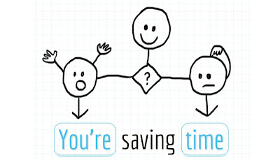
I recently came across a unique exploration into the connection between UX work and time. Andrew Mayfield, CEO of Optimal Workshop, digs deeper into this topic of how UX (user-experience) work and time-saving are connected in his interactive infographic called "You're saving time". 

Click the image below to open up Andrew's infographic:

 
Image by Andrew Mayfield, CEO, Optimal Workshop
Used with Permission

Thursday, October 11, 2012

More Does Not Necessarily Mean Better

I was thinking recently about the poem by Robert Frost, The Road Less Taken. For those unfamiliar with the poem, it begins with

“Two roads diverged in a yellow wood”……

It makes me wonder if a poet today had written such a piece  would they have begun with the following: 

“Forty-Two roads diverged in a wood...
-and then I just couldn’t make a choice”.
 
Today, no matter where we go and what we do, we are presented with choices, options and extras.
Sometimes it’s comforting to know we have options. Other times, the simplicity of a single path is a welcome relief from the overabundance of options available in so many aspects of our life.

One project of the past year illustrates this point particularly well.  

CASE STUDY:  Catholic Faith Handbook for Youth Catechist Guide

The project team for the Catholic Faith Handbook for Youth Catechist Guide wanted to ask our customers to evaluate the ease of use of a lesson plan format. The team sent two different lesson samples to five different customers and asked the customers to carry out specific tasks with each version.  (The tasks came from the teams understanding of the customer’s weekly lesson ritual which had emerged during their site observations.)
Then the team waited to receive the customer’s feedback. The team was seeking feedback not aimed at a customer’s impression of a product or whether they would prefer to use this product over another.  Rather, the team wanted to get to the root of the product and understand the customer’s experience of carrying out the specific lesson related tasks by using –and forging a path through-each of the two sample lesson plans.

How easy would it be for the customer to use the lesson plan to carry out the work they needed to complete?
What happened was something I don’t think the team anticipated. I know I didn’t.

This is a summary of what happened.

Brian S-T stopped by my (Heather’s) office and said, “We got our first reviewer back, do you want to see the feedback?”

We looked at the feedback and said to each other, “Well let's see, maybe it won't all be this clear.”

By the end, we were surprised, because this is what we saw.


With regards to using Lesson Plan “B”, customers said:  

  •  “Early on I realized that these lessons were a little too complicated for some of my teachers, so I streamline the lesson plans by writing the specific areas and activities they should cover in each lesson. Basically, I rewrite the lesson plans.”
  • “I feel this Lesson Plan was too cumbersome for a greenhorn volunteer teacher."
  • “This lesson would be difficult for those not used to looking through curriculums, and they might need to do a lot of preparation”.
  • “This plan is not very easy to use, especially if you have limited teaching experience.”
  • “It is way too much for what we need to teach our classes.  Our catechists get overwhelmed with all this information.”

With regards to using Lesson Plan “A”, customers said:  

  •  “Lesson Plan A is so much better for volunteer teachers who do not have formal teaching experience.”
  • “Lesson Plan A gave me much better direction.”
  • “These would be much easier for my catechists to use.”
  • “I like the simplicity of it.”
  • “I thought this was MUCH better than the other catechist handbooks that are out there as far as ease of use.”
  • “For us small parish volunteer teachers who are not theologians nor college educated teachers, and most of us have never attended a Catholic school, I found this format non-intimidating yet informative and chronologically arranged.  Easy to follow and good guidance.”
  • “I think this would be great for a volunteer catechist, it tells what the important things they need to learn are, gives activity ideas, and helps guide them into scripture and discussion.”
  • “It is very well laid out – not too much, just the right amount of information.”
  • “Thank you for creating lessons that volunteers can use!”

For the record, Lesson Plan “B” was the product in its current state of content and design, available for purchase on our website.  
 
Lesson Plan “A” was a version containing a variation of content quantity, activity ideas, design, layout and organization based on what we understood our customer may be needing.

After received the feedback, the project team reconvened and came to the conclusion that in terms of usability for our customers, it was pretty black and white.

In Lesson Plan “B” (the product in it’s current state of content and design) we had covered all the bases covered for the customer. This version assumed that the user would prefer the highly designed lesson plan and that the customer would need and want every option and every aspect of direction.

In Lesson Plan “B”, we wanted to provide the user with every possibility and in doing so, we gave them more than they could carry.

As a publisher, we want to help lighten the load of those we serve.

In Lesson Plan “A”, the project team came up with and then tested an innovative solution that involved--not adding to the lesson plan-- but rather scaling it back and highlighting a more clear-cut and direct path through the material.

As our customers persevere in their work of spreading the gospel, let’s assist them (as this project team did),  by continuing to clear the path of infinite options and light the way to a single path so that their experience is one of clarity and one which saves them time.  

As we do, we will continue to affirm for them that what they can expect from their partnership with us and their use of our products is an experience of –signature simplicity.


Thursday, September 27, 2012

Observation, Failure and the Road the Success

Last week, the newly formed product development and innovation team met for our first working session.We had a number of tasks to tackle on our agenda including brainstorming, data mining, ideation and product prototype creation.
One small part of our time together on the first day was spent talking about an article on the Culture of Innovation at 3M. We discussed some of the aspects that seem to contribute to the culture of innovation at this Minnesota-based company known the world over for its inventiveness and innovation.
  • We noted that 3M employees are given a percentage of time to work on any project they deem time-worthy and that often, new successful products for the company flow from this "percentage of time” people dedicate to working on their own ideas.
  • We recognized the role customer observation plays in understanding the habits as well as the articulated and unarticulated needs of their customers.
  • We also talked about the role failure plays on the road to success, the necessity of “being okay” with failure and of knowing that failure is a part of moving forward. Failure is part of the trial and error that is often the mark of innovation and re-invention.
At one point, we slowed the conversation and asked ourselves, “What does it mean to fail”.
Reflecting on this conversation after our meeting, and thinking about the many times I’ve heard people talk about the“importance of failure”, it still sometimes seems like the word itself –failure- is even an obstacle. There can be a palpable difference in the air, an almost hushed silence that comes over people when the word “failure” is spoken, as if the mere speaking of the word has the power make it a reality.
But what does the word “failure”mean? What does it mean “to fail”?
Being someone who likes to go back to the beginning and understand words at their origins, I looked up the word“failure” and “fail” in an online etymology dictionary: http://www.etymonline.com/.
fail
early 13c., from O.Fr. falir (11c., Mod.Fr. faillir) “be lacking, miss, not succeed,”
 
While the opposites “success and fail” are often looked at together, the words that jumped out at me were the first two: to be lacking, to miss.
As we continued our conversation as a product development and innovation team, this is exactly where we ended up going. We uncovered this reality: Just because a product doesn’t hit a home run with our customers right out of the gate, it doesn’t mean that it is over or at its end.
Rather, if something fails, it’s because somewhere in the product, something was lacking or missed the mark with our customers.
So, we figure out what missed the mark and try it again.
THAT is the beginning to reinvention and innovation.
 ______________________________________________________
To read the article on the 3M’s Culture of Innovation:  3M: The Culture of Innovation

Thursday, August 9, 2012

Innovation: There is more than one way to...

Our user experience (UX) work to date has given us opportunities to consider new products, new formats for existing products, new processes and new ways of thinking. It has given us and will continue to give us opportunities to innovate.


INNOVATION


1
: the introduction of something new
2
: a new idea, method, or device

The concept embedded within the work of innovation is the belief that many things in life-whether they be methods, processes, products,  approaches, or thinking -can be done in new ways, or ways different than they've been done before. 

Never is that reality more clear than when you watch a young child. Rarely do they approach things with the assumptions or certainty that our age and wisdom allow us to bring forward. Rather, children, by their very state in life, have this "beginner's mind", this idea of approaching everything as new, of not leaving possibilities unturned.

In some cases, it's because everything IS new for them and they are experiencing things for the first time. Sometimes, they have a beginners mind because they have not yet decided that one way is the only way or a better way. Other times, they have a beginners mind because their curiosity leads them to wonder if there is more to discover.

I was surprised the last time I visited my sister when I happened to catch my nephew discovering there was more than one way to use a piano bench. As he was playing, he leaned back on the piano bench, flipped it over, knelt down on top of it and kept playing. Hmmmm. Innovation and a beginner's mind at work.

Sometimes, it's when things are turned upside down (or feel like they are turned upside down), that we see things not just for what they are, but for what they can be, not just as something turned upside down, but as something wholly new-- a new way to use or engage with the product or process in front of us.

During one of the next company meetings, I've asked Sara, Jim and Brian to lead us in an activity that was first done on the innovation retreat in May. It is an activity about looking at a simple everyday object in new ways.


To view the "innovation of the piano bench" on YouTube, click below: